




Our wedding album photos: a black and white cover, pages that lie flat and a glossy park cover
Read the full story
A white cover in window light
We set the albums down one at a time on a dark timber table beside a big window, with no lamps at all. The first was a white album with a photo cover: a bride and groom in a soft black and white embrace, his cheek against her veil, and their names in fine script on a white band underneath. Dark wood under a white album is our favourite pairing, because the contrast shows the edges and the shape of the book before you see a single page.
Pages as thick as card
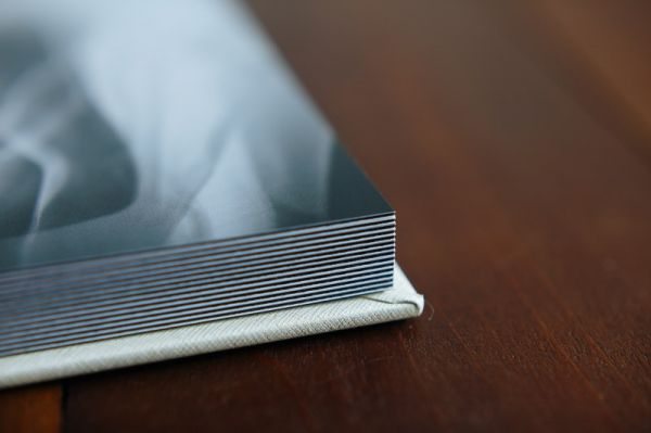
Then we tilted it and came in close on the edge. The pages are thick and rigid, stacked in neat lines like a closed deck of cards, with the cover wrapping around them in white. That thickness is what lets a spread lie completely flat when the album is open, so a photo can run right across the middle without disappearing into a fold. We shot the edge with a shallow focus, so the cover photo melts into a blur above the pages.
A smile through the car window
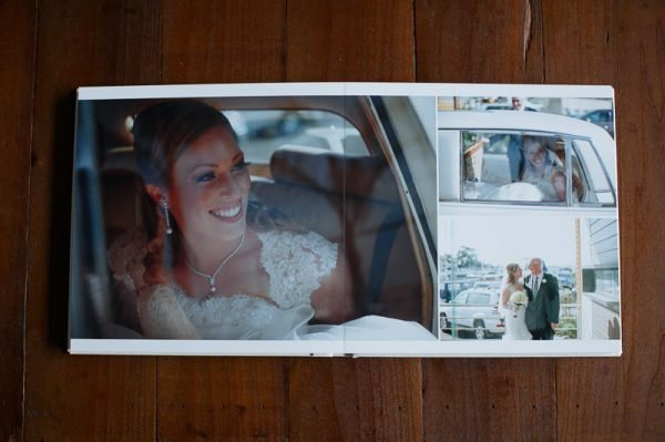
Opened up, the album gave us a spread built around one big photo: the bride laughing in the back of a vintage car, lace sleeves and a pendant catching the light through the window. Beside it, two smaller frames stacked on the right showed the car from outside and the bride beside an older loved one among the parked cars. One large picture with a couple of small ones is a layout we use often, because it tells a moment and its context at a glance.
Two covers, two moods
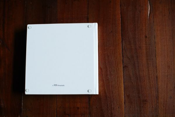
The back cover was plain white with our small studio mark near the spine, and little feet in each corner to keep it off the table. Next to it we laid a second album with a full-colour cover: a couple kissing against deep green trees, the groom in a navy suit with an orange flower, and their initials stacked in a slim white box at the top. Put side by side, the two covers show how much a cover decides the feel of the whole book.
Quiet black and white pages
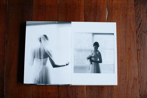
Inside, one spread kept to black and white: on the left a full-page bride seen from behind, her veil falling down her back as she reached for the light; on the right a smaller frame of her standing at a tall window with her bouquet, set inside a white border. Pairing a full-bleed page with a bordered one gives a spread room to breathe. We photographed it flat from straight above, so the pages stayed square and true.
A park under glass
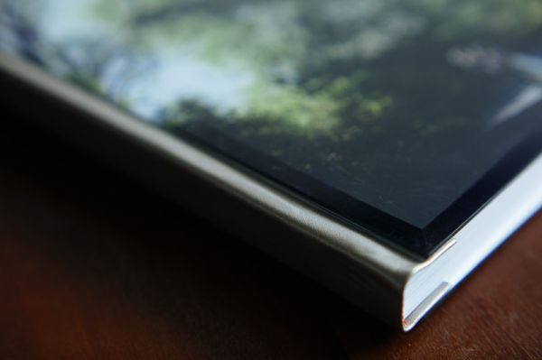
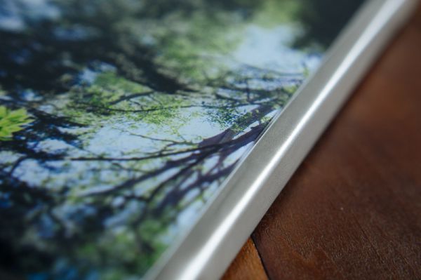
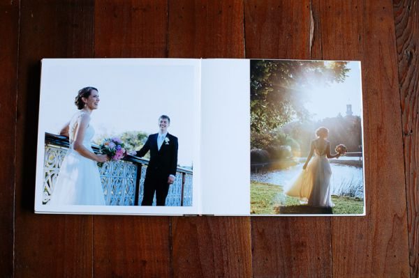
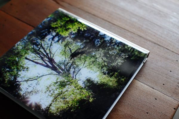
The last album had a glossy cover with a couple standing tiny beneath enormous trees in a park, sunlight pouring through the leaves and their names in white script across the canopy. We angled it towards the window until the gloss caught the light along the edge. Inside, a bride and groom laughed at an ornate white iron balustrade, and across the gutter a bride walked beside the water into a low, golden sun. It was a lovely way to finish: a whole day, held in two hands.